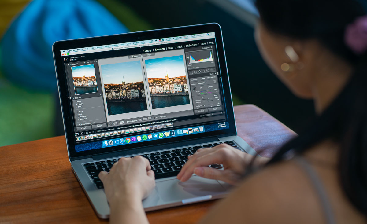
Give your travel photos a new life with these simple Lightroom editing tips you can apply right away, perfect for beginners!
The first time I came across jargon like ‘Tone Curve’ and ‘Split Tone’, I was perplexed. It was my student exchange in Germany and the iPhone photos just didn’t do the memories justice.
After spending lots of time experimenting and practising, I eventually got the hang of these functions on Lightroom. I even created a workflow, and learnt new tricks to create richer, aesthetically pleasing photos.
In this article, I’ve compiled 9 simple editing tips I wished I knew as a beginner and hopefully these will help you in your own photo editing journey!
1) The ‘Auto’ function
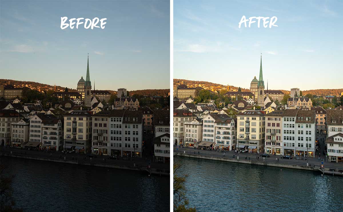
You’d be surprised how much an image can improve with just one click.
Lightroom’s ‘Auto’ function analyses your image and makes minor adjustments to basic tools like the Exposure, Highlights, Shadows and Saturation. From there, you can tweak the adjustments to your liking.
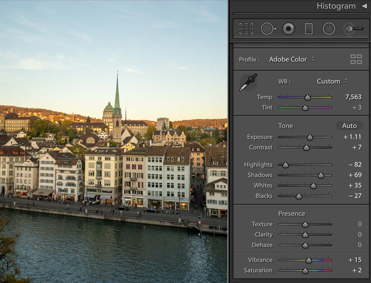
In this photo, I was satisfied with the other ‘Auto’ adjustments, so I increased the temperature of the photo just a tad bit to make the sunset warmer.
Avoid altering the Exposure and Contrast sliders too much as they affect the entire image — you may end up with dark or overexposed photos. Instead, bring out the details with the Highlights, Shadows, Whites and Blacks sliders. These tools adjust specific light and dark areas of your photo, so feel free to experiment!
*Pro-tip: Double-click on a slider to reset it. This will save loads of time if you’re looking to quickly reset a bunch of sliders.
2) Correct distorted perspectives with the Transform tool
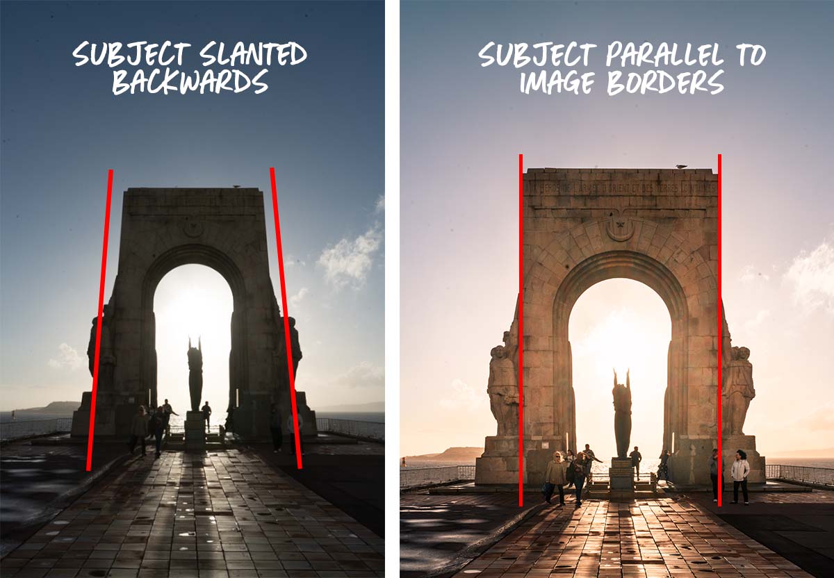
The Transform tool in Lightroom corrects perspective distortions in images. Distortions often happen when shooting architecture up close, as your camera is tilted upwards or downwards when trying to capture the full building.
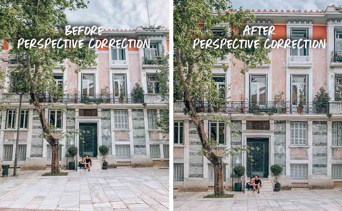
In the examples above, the building on the left looks like it’s leaning back towards the sky, making the whole image appear warped. But, after correcting the distortion, the building’s lines on the right are straighter and perpendicular to the ground — this makes the photo look more appealing and realistic.
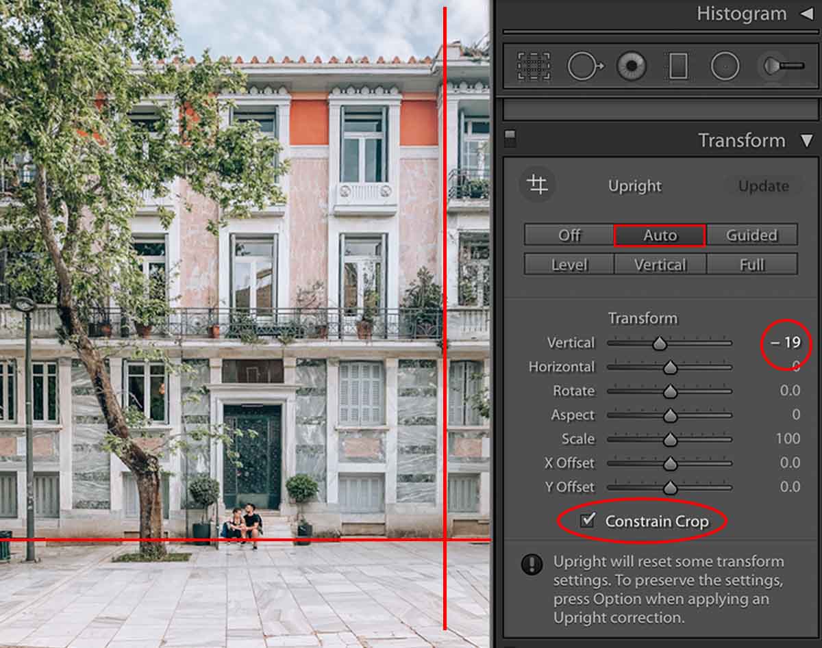
Imagine straight lines drawn across your photo to guide you.
To start, tap ‘Auto’ under the Transform panel. Lightroom attempts to detect and correct the lines in your photo. If you think the lines can be straighter, toggle the Vertical and Horizontal sliders to adjust the image perspective.
*Pro-tip: Check ‘Constrain Crop’ to prevent a white background from appearing while straightening your image.
3) Vary editing styles with the Tone Curve
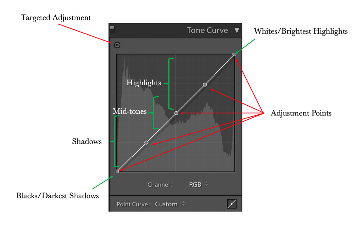
The Tone Curve allows you to edit specific tones in your image. Each point on the curve represents a range of tones, from the darkest shadows to the brightest highlights.
You can create points anywhere on the curve. However, a small adjustment to any point can make a huge difference to the brightness and contrast of your photo. Hence, I recommend following the example above and placing one at every grid intersection first.
To delete points on the Tone Curve, either right-click or double left-click that specific one.
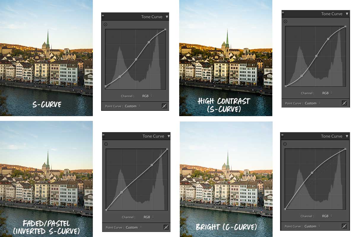
Different curves lead to different styles of photo edits. Here are four simple examples you can try:
1) S-curve: Photographers commonly use this curve to make basic lighting adjustments. By bringing up the highlights, the curve adds a higher contrast to your photo — the bright parts of the photo are brighter and the shadows darker.
2) High contrast (S-curve): A more extreme edit of the S-Curve, this curve is normally used for dramatic edits, where the shadows are more prominent.
3) Pastel/Faded (Inverted S-curve): Compared to a vibrant contrast, this curve adds a softness to your photo. It lightens the shadows and decreases the highlights, which gives the brighter parts of your photo a slight greyish look.
4) Bright (C-curve): This curve is great for brightening photos that were shot at night or in dark areas. By creating just one point in the centre of your Tone Curve, you simultaneously lighten both highlights and shadows.
Ultimately, the number of adjustment points you add depends on how many tones you want to manipulate in your photo.
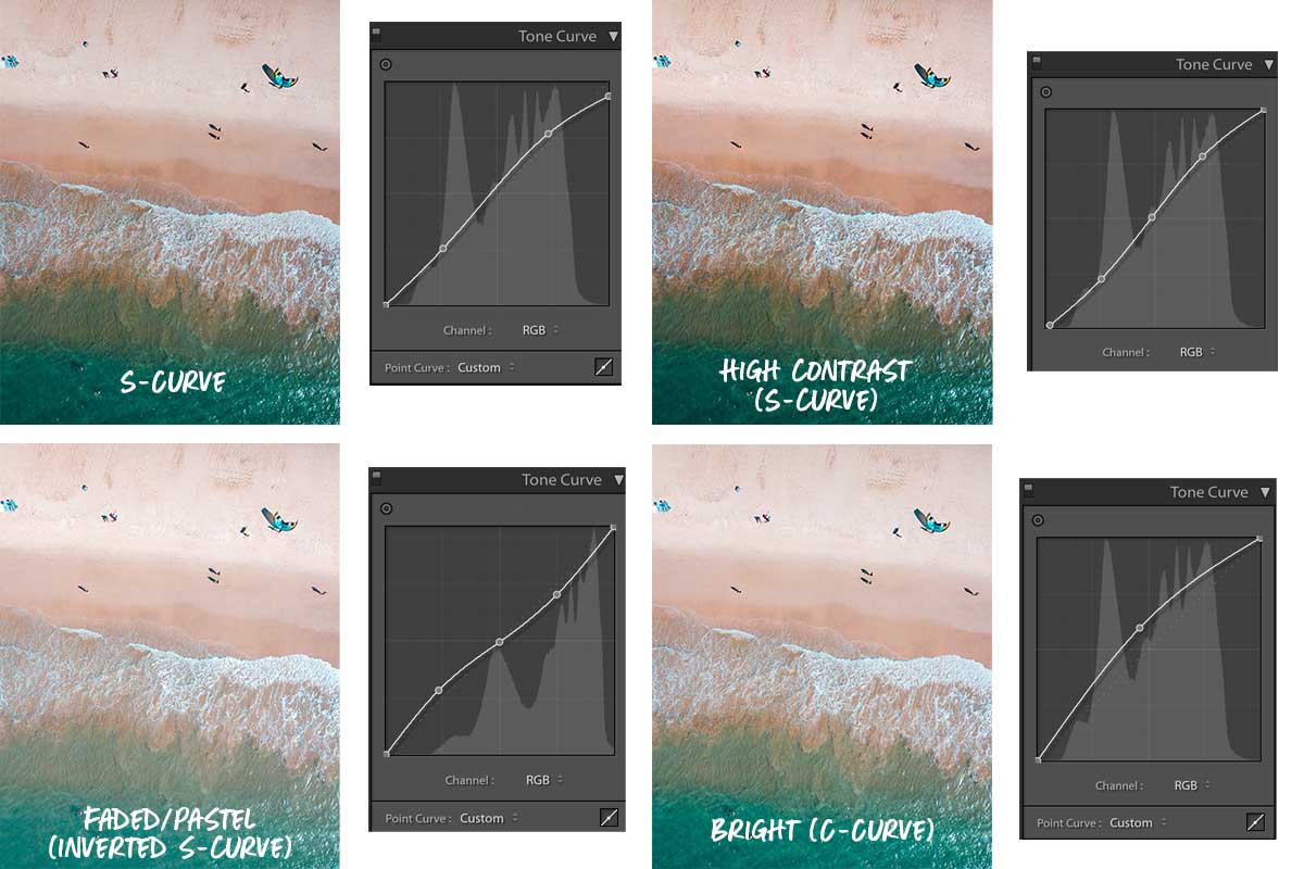
Here’s a photo of a beach edited with the same curves. Different styles look better on certain photos, but play around and discover what you like!
*Pro-tip: Press the ‘\’ button on your keyboard to toggle between the original and the edited.
4) Make colours pop with HSL
HSL stands for Hue, Saturation and Luminance. The Hue slider changes the shade of your selected colour, Saturation adjusts the intensity, while Luminance determines how light or dark the colour is.
With this creative tool, you can de-saturate colours in your photo for a moody feel or even change the colour of the sky to purple!
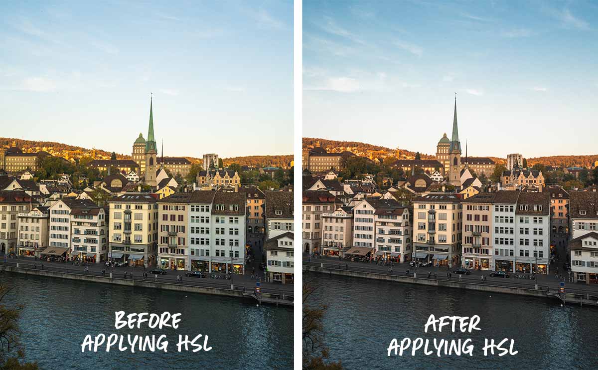
In the example above, I shifted the Yellow Hue and made the yellows more orangey, which gives the sunset a more vibrant look. I also lowered the Green Saturation to reduce a greenish tint on the buildings. Lastly, I reduced the Blue Luminance to bring out the colour’s intensity in the sky. Here’s how each slider looks like:

If you want to modify specific colours, use the targeted adjustment tool to change its Hue, Saturation or Luminance accordingly. Simply select the ‘dot’ icon at the corner and hover over the area you want to change. Then, drag your mouse up or down to increase or decrease the sliders.
5) Add an artistic edge with the Calibration panel
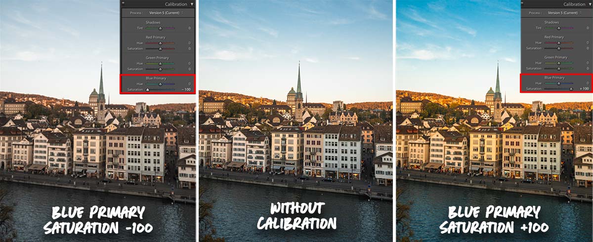
Located at the last section below, the Calibration panel is a colour correcting tool that alters all the colours in the image instead of a single colour.
Every pixel is made up of red, green and blue in different ratios. So, adjusting the Blue Primary Saturation will change all the blues present in each pixel throughout the entire image — including the buildings, sky and river. This works the same for all the other sliders.
Recently, this has been a popular tool for artistic edits. It’s also the secret behind the popular teal and orange filter you see on Instagram! To achieve this edit, move the Blue Primary Hue slider to the left.
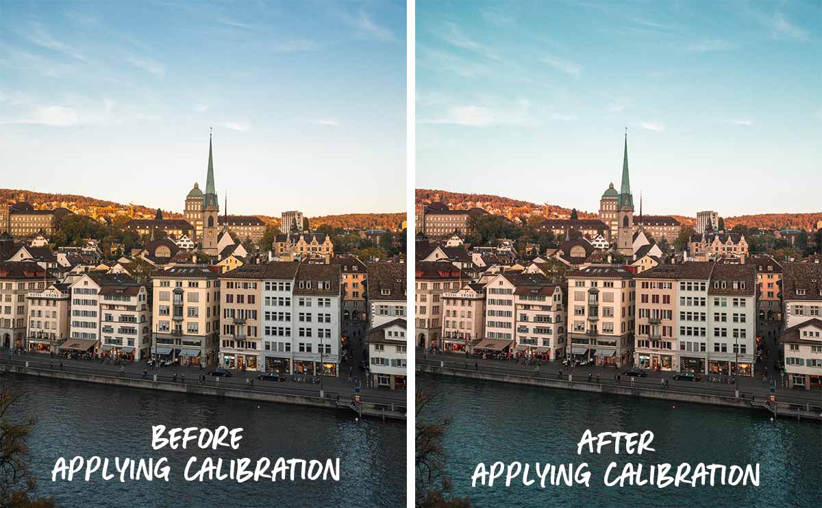
In the example above, I boosted the Green Primary Hue by +45 to add a teal shade to the sky, and a slight red tint to the oranges. Just like blue and orange, red and green are complementary colours — they provide the photo with a colour contrast that’s pleasing to the eye.
6) Create brighter sunsets or cinematic shots with Split Tone
Split Tone adds colours to the highlights or the shadows of your photo independently. It’s often used to bring out the desired atmosphere or mood in your photo.

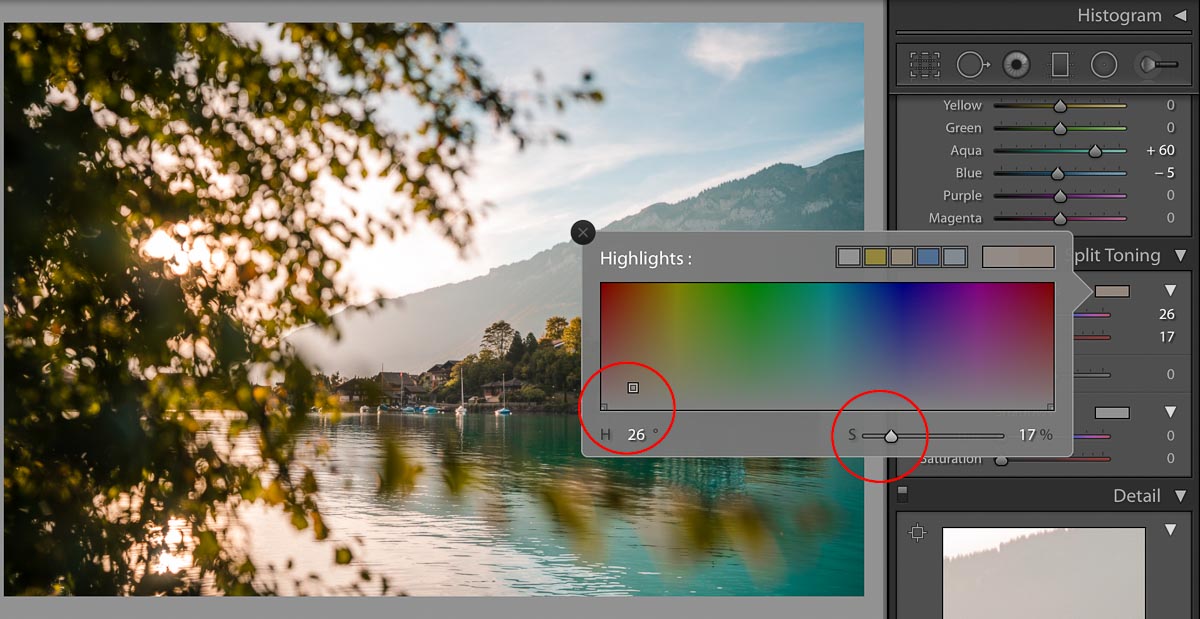
This tool is best used for sunrise or sunset photos. By adding a subtle orange tint to the highlights, the sun’s glow can look brighter and stronger (almost like you’re watching it in person).
Here are the specific edits I’ve made to add a pop of orange to the sunset below — try it for your own photos!
Sunsets aside, Split Tone can also be used to give your photos a cinematic look. One trick is to add an orange highlight and a blue shadow. As mentioned previously, warm highlights and cool shadows work well as they’re complementary colours.
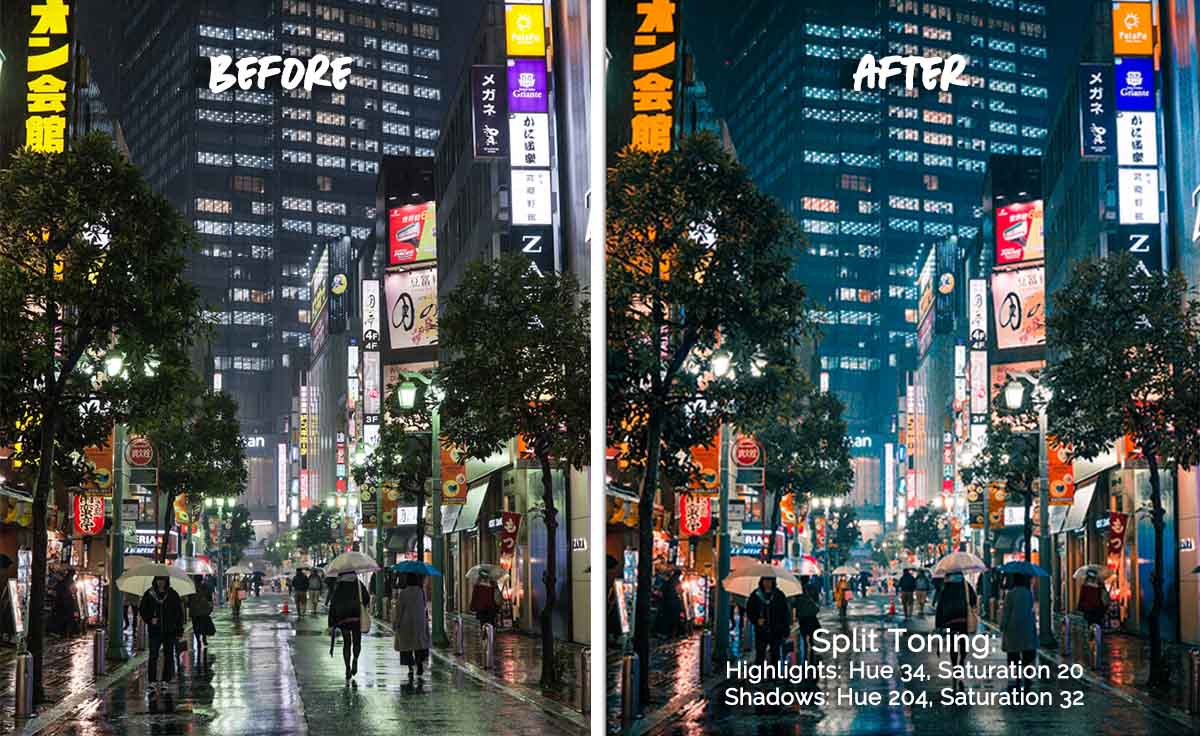
From a plain photo to something out of a futuristic film.
You can create a wide variety of styles with just this tool — it’s up to your imagination and experimentation!
*Pro-tip: Keep the saturation below 40% to prevent your image from being dominated by a single colour.
7) Get rid of gloomy or overexposed skies with Dehaze
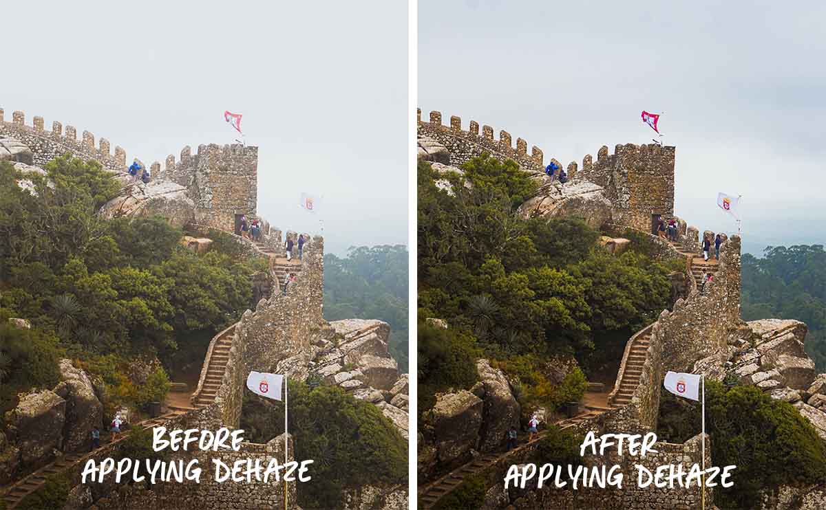
The Dehaze tool is excellent for correcting photos with grey and gloomy skies. It makes your photos clearer by sharpening the outline of your subject, and darkening the overall colours. In this case, applying Dehaze brings out the details of the castle from the hazy skies.
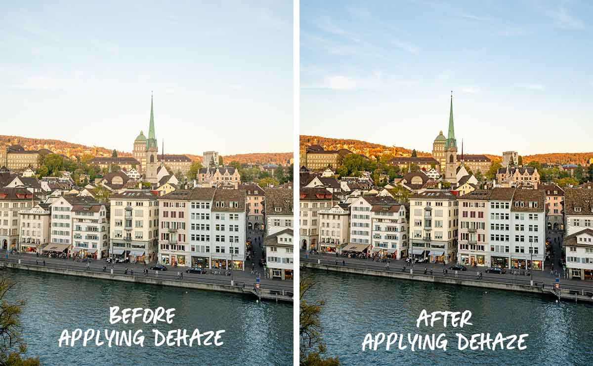
You can also use Dehaze to compensate for overexposed images, as it helps to develop the definition of your subject and its colours.
8) Enhance photo elements with Graduated, Radial and Brush filters
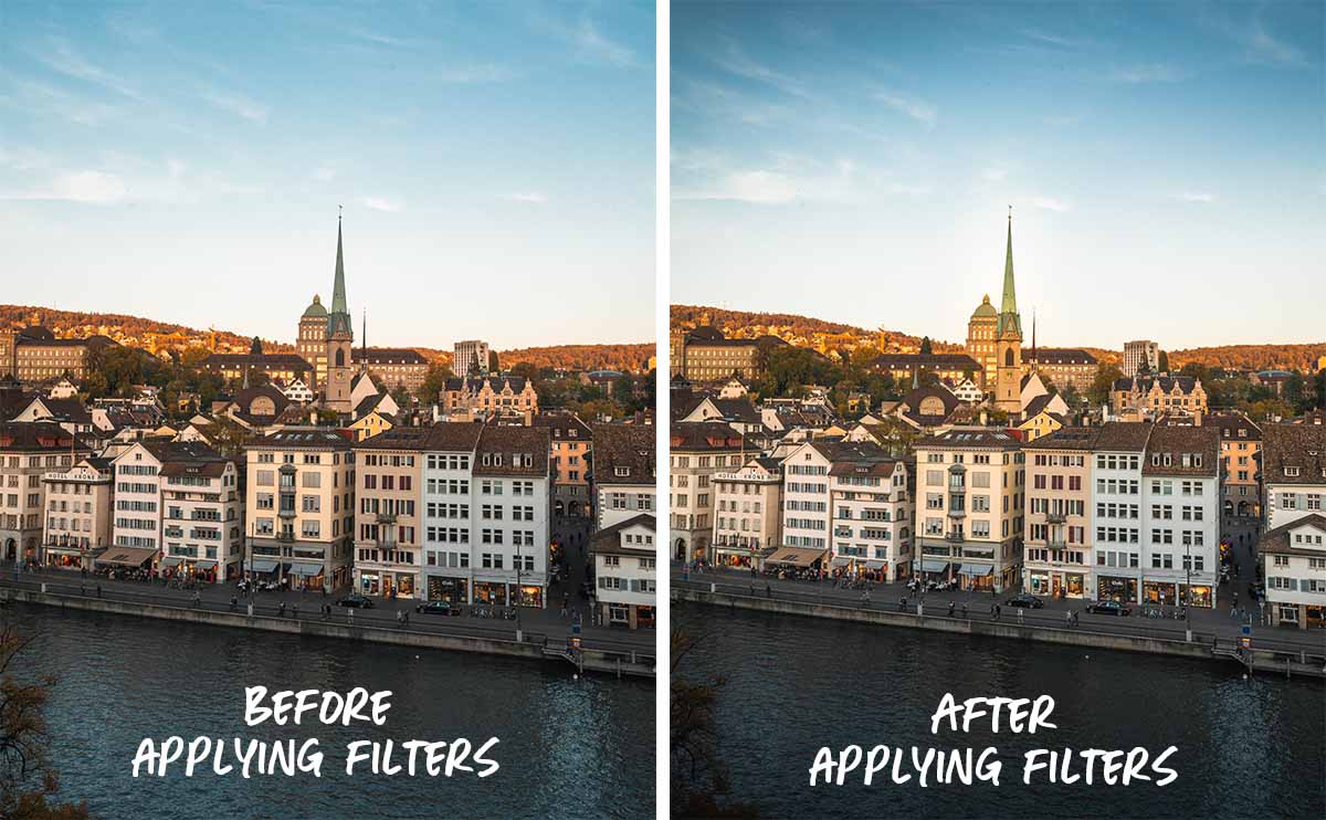
Graduated, Radial and Brush filters are powerful tools that allow you to make selective edits to your photo, without affecting the rest of the image. Here’s how I used all three to make my edits:
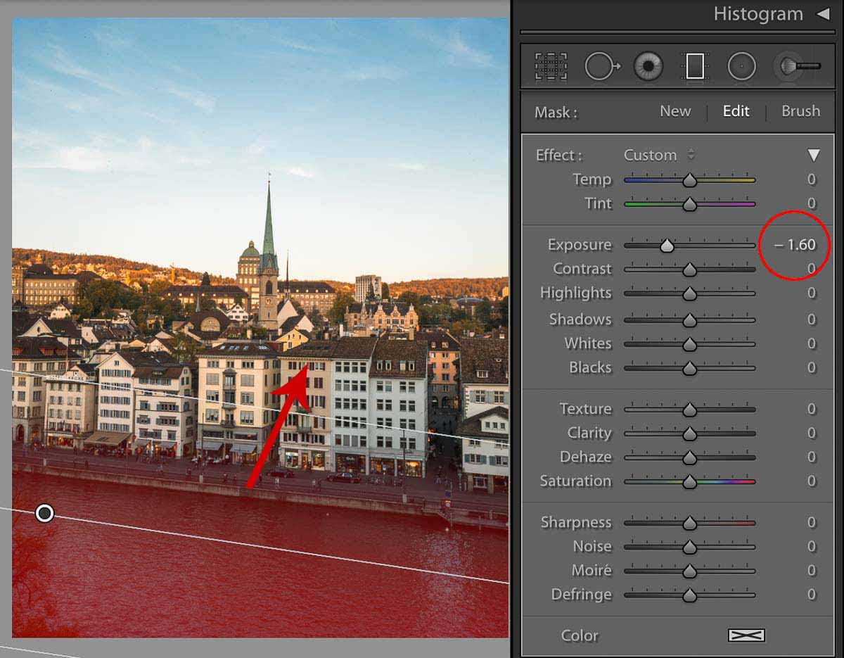
Graduated filters can be used to guide the viewer’s eyes towards a subject. In this case, the tower is the focus of my photo. So, I applied a diagonal Graduated filter on the river and reduced its exposure to draw the viewer’s eyes toward the tower.
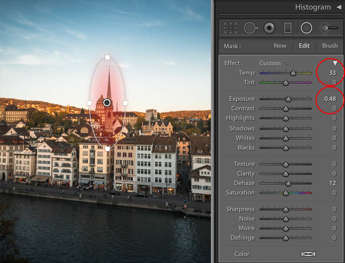
Radial filters have the ability to highlight your subject. Above, I made the tower brighter so that it stands out amongst the buildings.
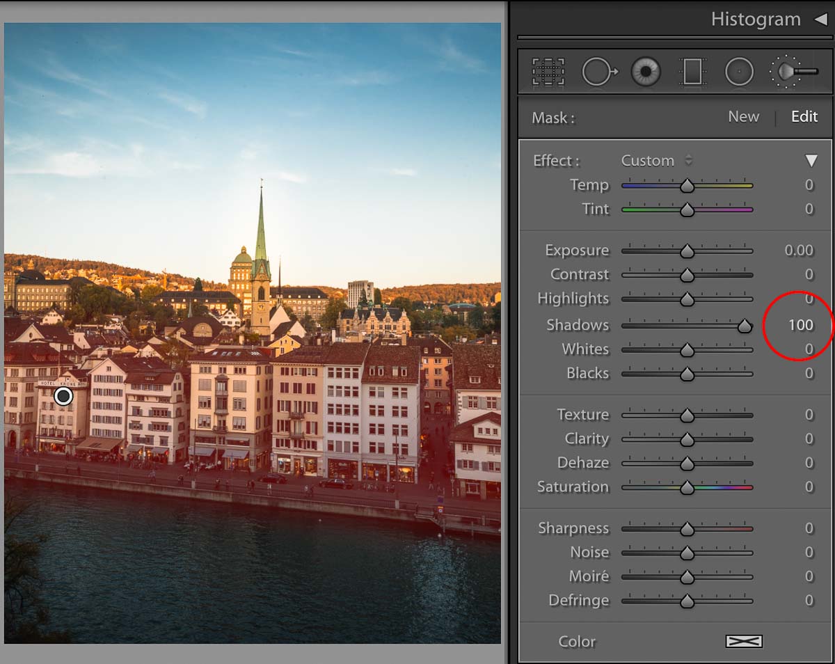
The Brush filter (Adjustment Brush) in Lightroom is useful in editing areas that cannot be covered with a Graduated or Radial filter. Like its namesake, you can use it to paint over specific areas. Here, I painted the buildings and lightened the shadows to create an additional contrast with the dark river in front of it.
If you accidentally painted over an undesired area, hold the ‘Alt’ key on a PC or the ‘Option’ key on a Mac to turn the Adjustment Brush into an Erase brush.
*Pro-tip: Toggle the ‘O’ button to see which areas have been covered by the brush.
9) Create presets to save and share
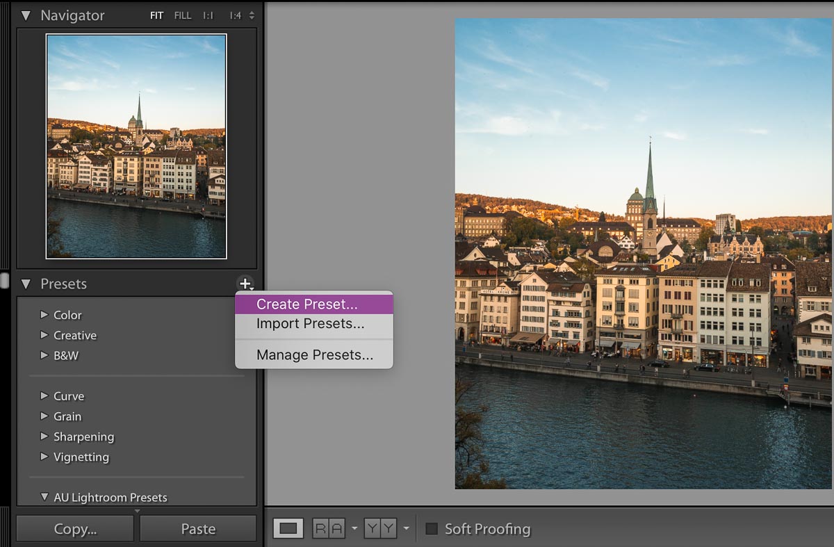
So, you’ve created the perfect preset and want to use it for all your photos, and even share them! Just hit the ‘+’ sign on the Presets panel, then ‘Create Preset’. Voila!
After creating your preset, it’ll appear in the Presets column. Simply click on it to apply to your other photos. But, do note that a preset may not work for all photos due to different lighting conditions and camera settings.
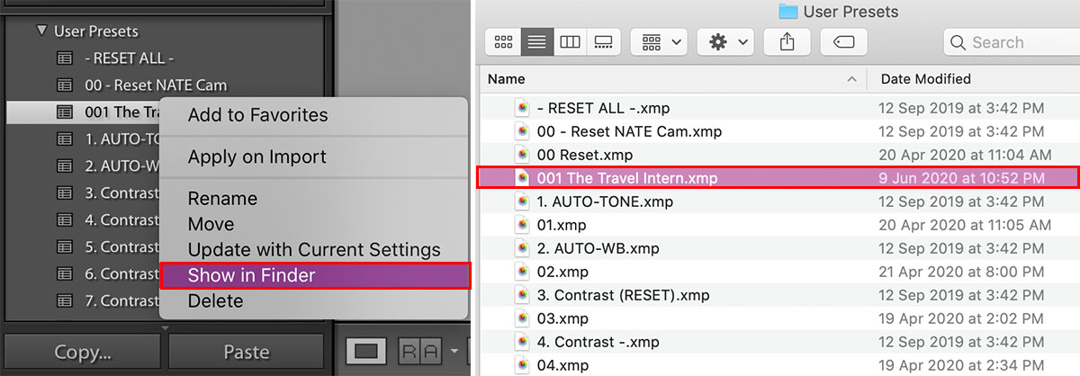
To share your preset, right-click the preset and select ‘Show in Finder’ to obtain the file. For PC users, select ‘Export’ and choose the destination folder. You can share them with your friends after!
To install a preset, click on the ‘+’ sign on the Presets panel, then ‘Import Preset’.
Other useful photo editing apps
1) Lightroom Mobile
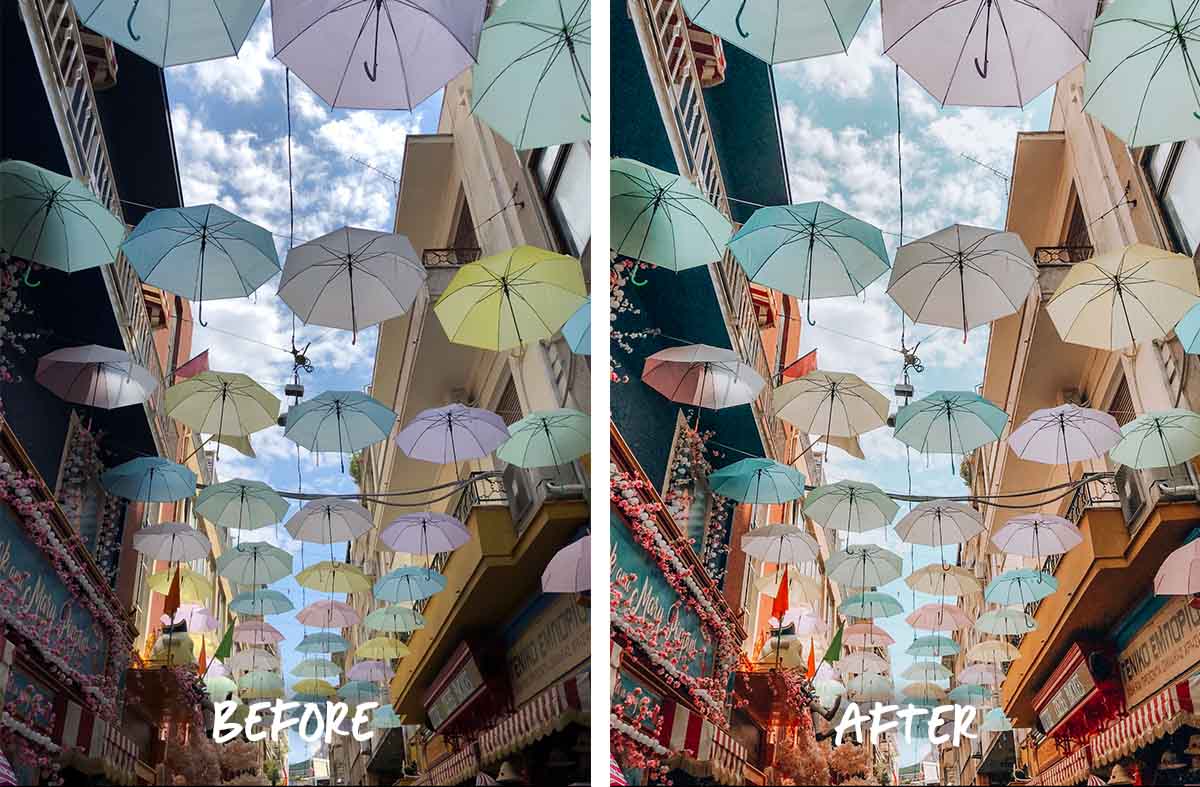
Lightroom Mobile is still a great app for editing photos if you don’t have easy access to your laptop. It has the same functions as the desktop version (yay!), except for Perspective Correction, Filters, and Calibration. That said, you can apply all other techniques you’ve read in this article for the app!
2) VSCO
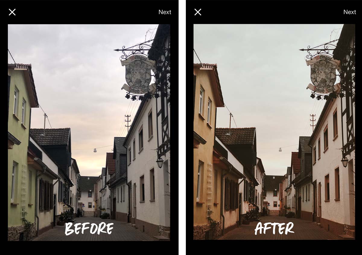
Aside from Lightroom Mobile, VSCO is my next go-to for photo editing. It’s best known for its user-friendly interface and variety of free filters. I also use VSCO to correct perspective lines since it’s a premium function in Lightroom Mobile.
The app also features similar Lightroom functions, such as Split Tone and HSL. However, the latter requires a VSCO Membership.
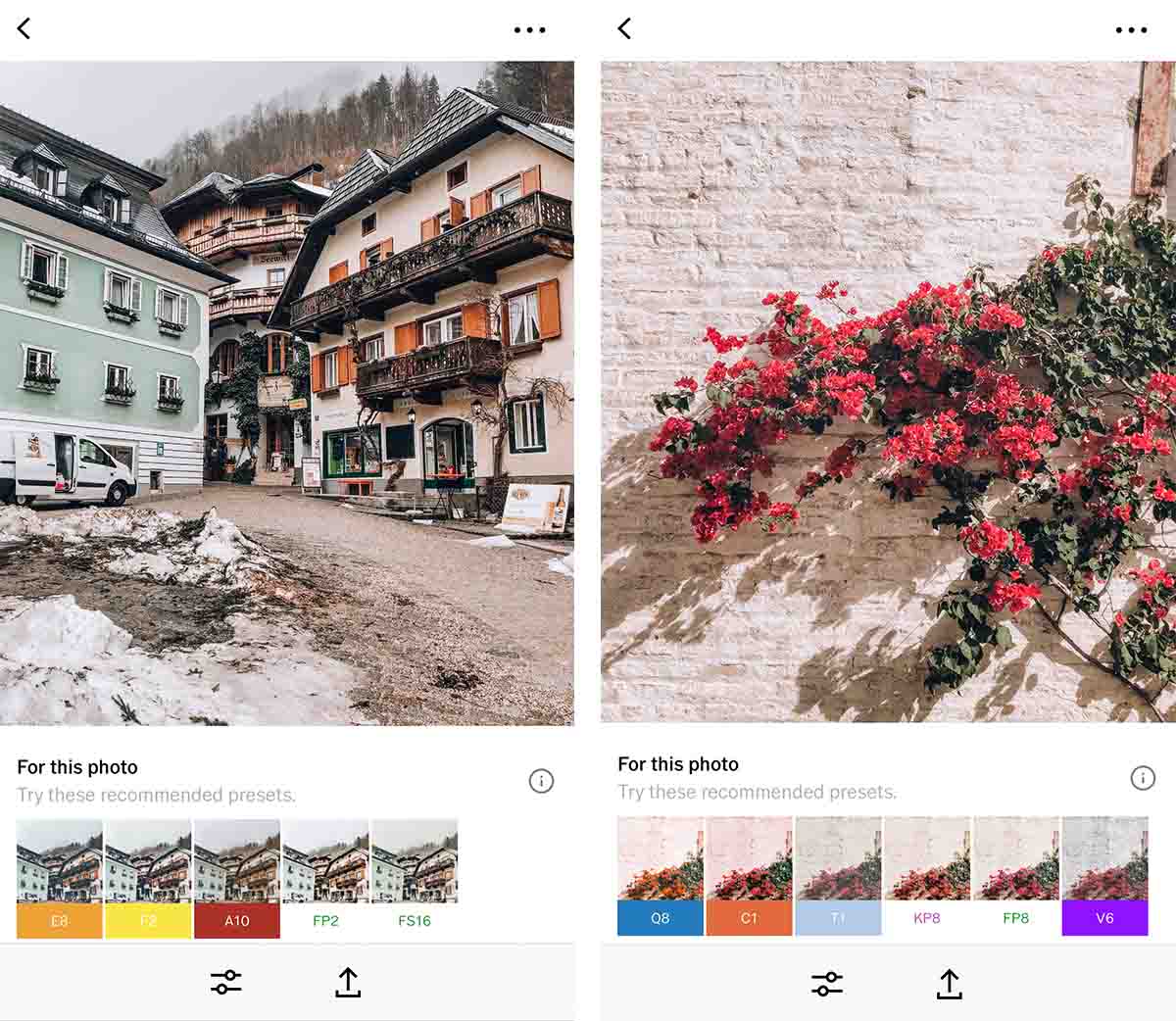
VSCO also offers filter suggestions based on your photo. I find this extremely helpful when I don’t want to spend too much time searching for a filter to use.
3) Snapseed
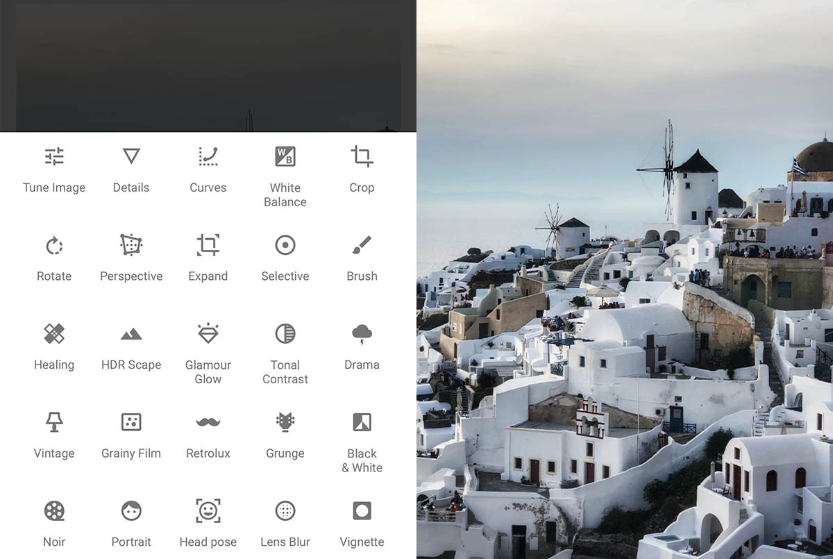
When I started exploring Snapseed, I was wow-ed by its ease of use and wide range of filters and features.
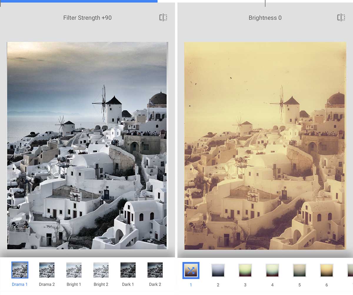
‘Drama’ and ‘Retrolux’ are some of the many filters Snapseed offers.
Unfortunately, Snapseed doesn’t include features to edit Shadows, Highlights or HSL. However, this beginner-friendly app has a ton of cool filters that’ll style your photos and make them pop instantly. It’s pretty difficult to achieve these edits in Lightroom Mobile or VSCO, so this is a good alternative!
Now, it’s time to create your masterpiece
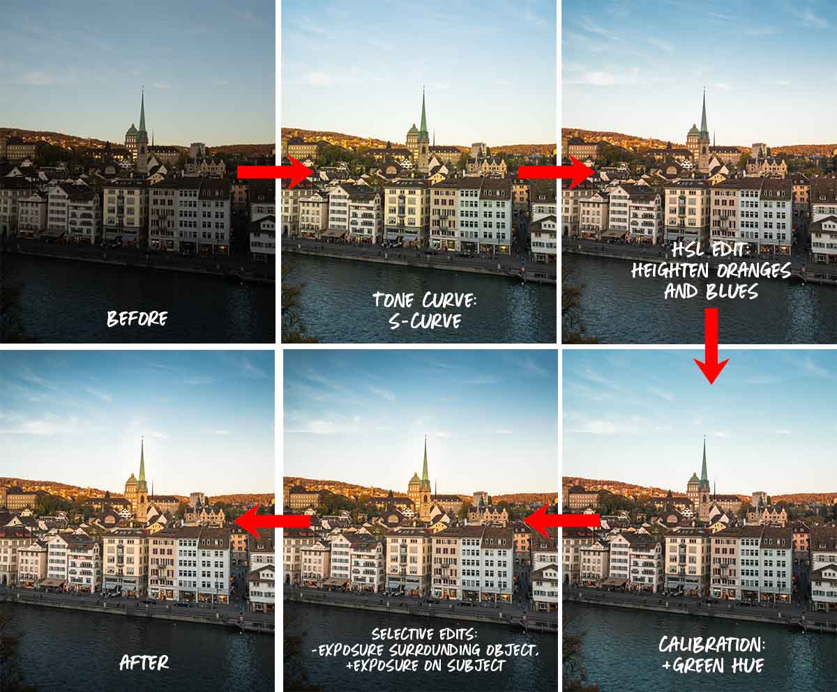
After applying almost all the techniques, here’s the final result!
I hope these tips have helped you with your editing journey on Lightroom. Editing doesn’t have to be as daunting as it seems! However, the trick to ultimately improve your photo-editing skills is to keep practising — you’ll train your eye to spot nuances in different colour tones and shades. In time, you might even become a pro!
Have fun playing around with the different tools, and show us what you’ve come up with by tagging your photos with #thetravelintern on Instagram! 🤪
Any Lightroom editing tips we missed on? Let us know in the comments below!


